Clients: British Gas and British Airways
To support with their ongoing BAU work and to help create a consistent UI and UX language, I’ve helped framed, develop, consolidate and establish a design language derived from their existing collateral as well as any on-going or new pieces of work that was being developed in the organisation.
These projects help stem by belief in the importance of establishing a good UI/UX foundation at the start of any project that allows for scalability.
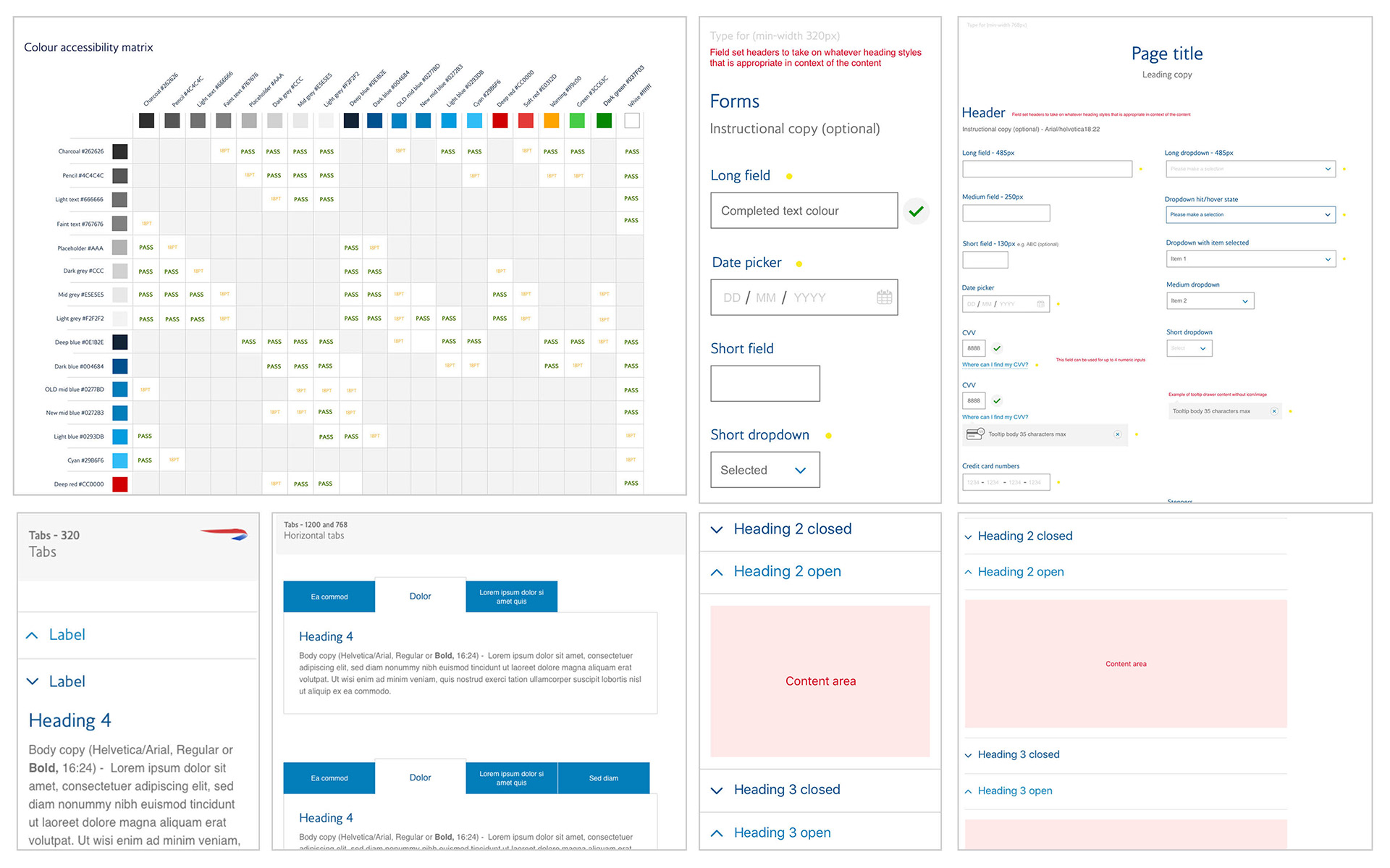
British airways
The problem: Having always been a desktop-first site with a mobile-web site, British Airways was looking into having a responsive site - but lacked documentation on how to move forward
My role: I came in as a consultant capacity to establish and set-up the framework, which became the scope of the project as well as oversee the production/design of the initial components.
The task: To consolidate their different style guides (there were about 3) and transform them into a unified language for the responsive behaviors and deliver this into an online interactive style guide, containing the code base, the design and its usage.
The process: We used the existing guidelines as the starting point and proceeded to audit the platforms to identify the discrepancies, and group them into the relevant content types or patterns. Next was consolidating these as well as adding more to the list based on what I knew was required having defined design systems/patterns previously.
British Gas
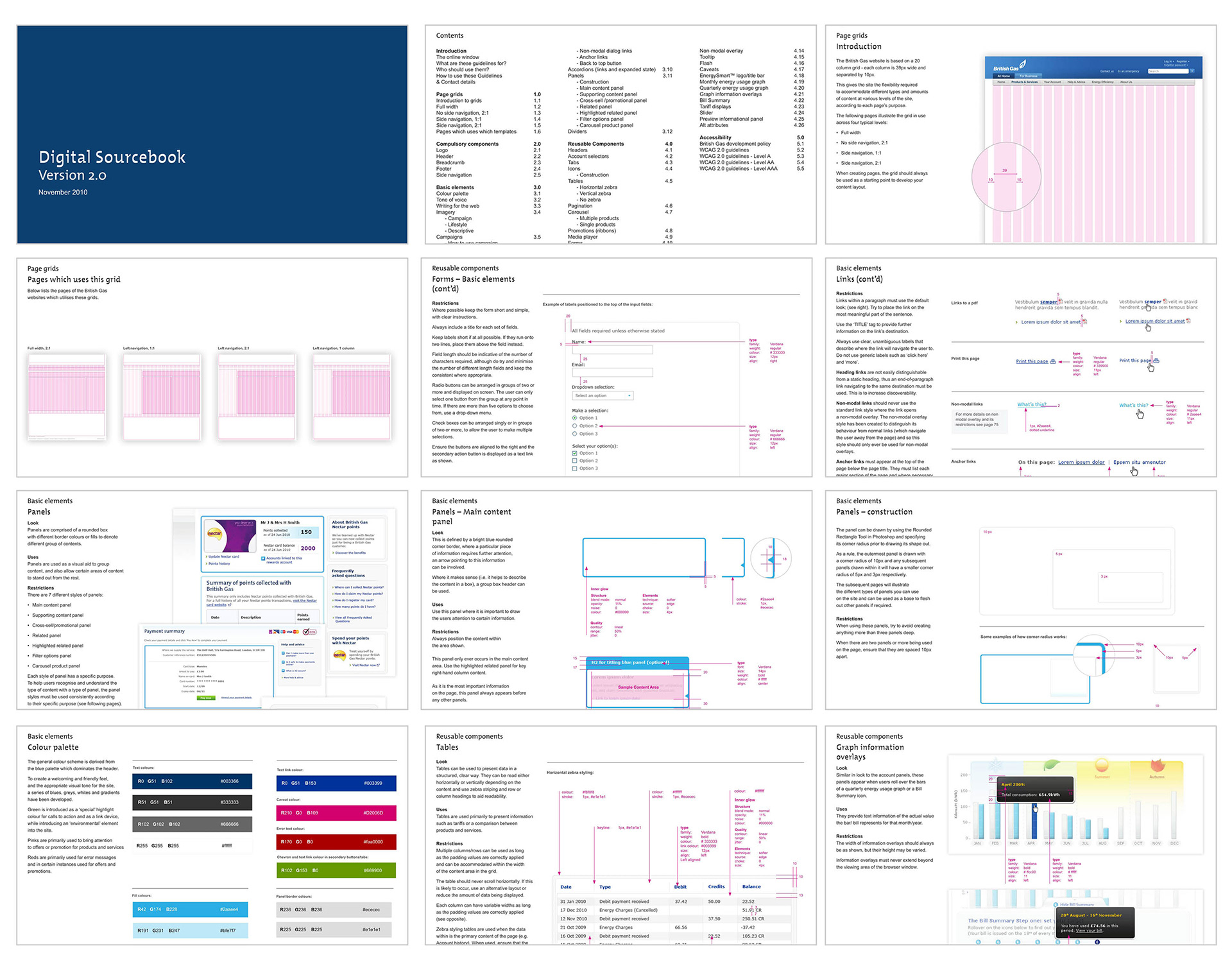
The problem: Whilst British Gas had a fully functioning site, they did not have any artwork files or reference materials that detailed how the site design came about. (i.e. there was no grid definition, no colour definition, no PSD files etc.). Thus when Product Owners needed to add a new feature, as there was no visual guidance on how to create one, liberties were taken resulting in visual inconsistencies and usage throughout the site.
My role: To define a visual language and usage of the components that was already existing on the live desktop site (this was done before responsive was the standard).
The process: A site audit was taken place to pick out all the inconsistencies throughout the site - the various font sizes, CTA colours, wrong usage of certain elements etc. Once these have been identified, the next task was to consolidate them so that there be one style for each element. I also retrofitted a grid system/logic to the site as well and helped defined the various templates that corresponded with how it was used on the site.
The result: With the creation of this document, it gave the brand guardian (a newly set-up role) leverage and control of the visual output and usage of any new items that had to be published on the site. In addition, the document served as a base reference for the upcoming re-design exercises as it served as a reference point of what items/pieces of content had to be skinned.