Problem: Users were struggling to understand Vitality Health’s proposition and thus was not able to engage with its health program and rewards scheme
Role & responsibilities:
- Lead designer and co-led team
- Concept and design delivery
- Stakeholder management
- Vision and prototype
- Lead designer and co-led team
- Concept and design delivery
- Stakeholder management
- Vision and prototype
__
Step 1: Research, research, research
Understand the audience: Access to end users was limited due to budget constraints thus we relied on second-hand information via the Business SME.
Analyse the brand: To understand Vitality's USP existing brand guidelines was leverage -
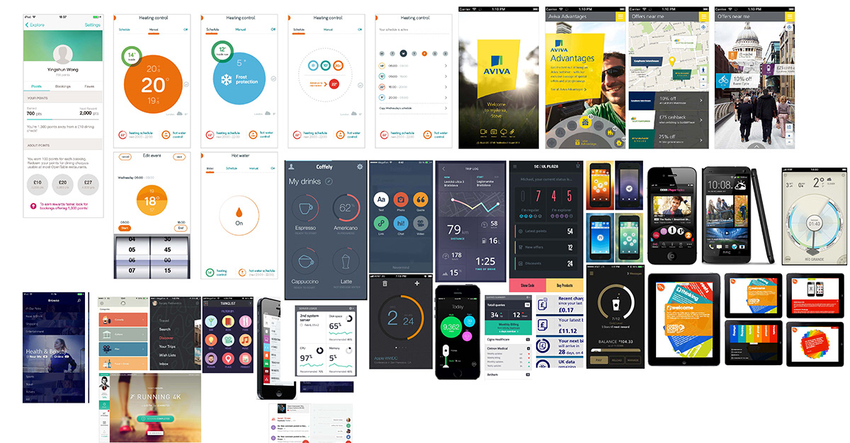
Led collaboration in competitor analysis and alignment: I set up a pinterest board for the team to collaborate on and facilitated sessions for the team to encourage open feedback to align on UX/UI direction with Business SME.
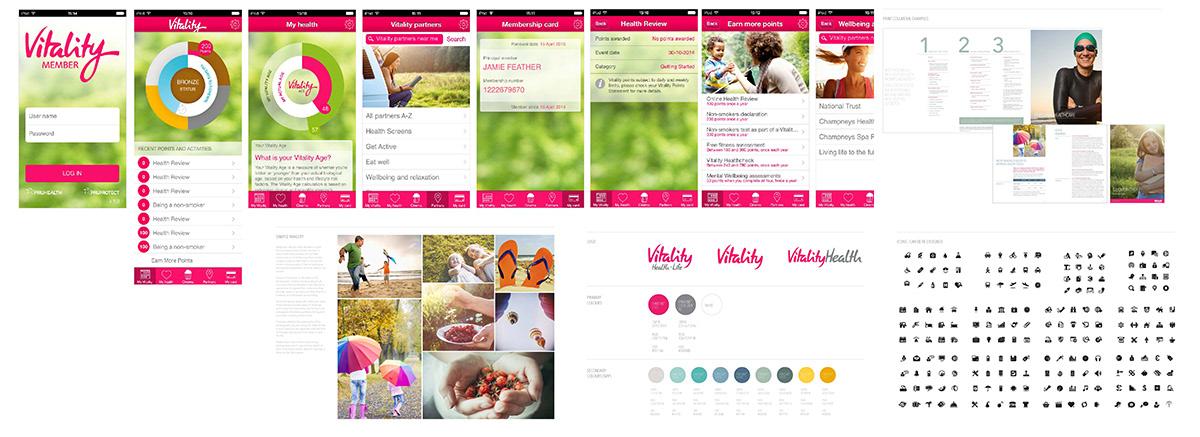
Brand board - a collation of Vitality's brand assets ( and their existing app)
Feature board - showing examples of good visualisation of dashboards and tracking activities, more on Pinterest
__
Step 2: Explore & refine
Ideate & develop: I co-led ideation sessions with the team and ran regular review to flesh out the journeys and explore onboarding strategies for different customer segments.
Establish experience principles: Led creation of Experience Principles with inputs from the regular review sessions, helping the team to align to a common vision.
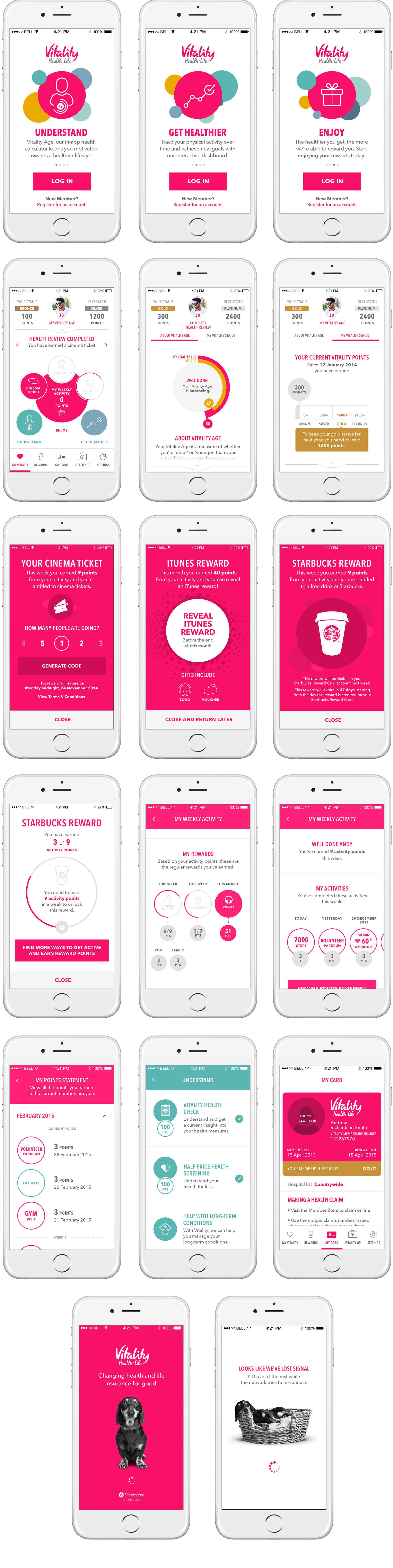
Demonstrating the north star experience: A site map and end-to-end prototype journey was created to help bring the experience to life and enabled the Business SME to get buy-in from his internal stakeholders. Key was to ensure that the dashboard had to work hard as a means to reflect the points they were accruing towards their rewards, membership status and improving their Vitality Age as it was recommended that this was the key proposition that motivated the customers.
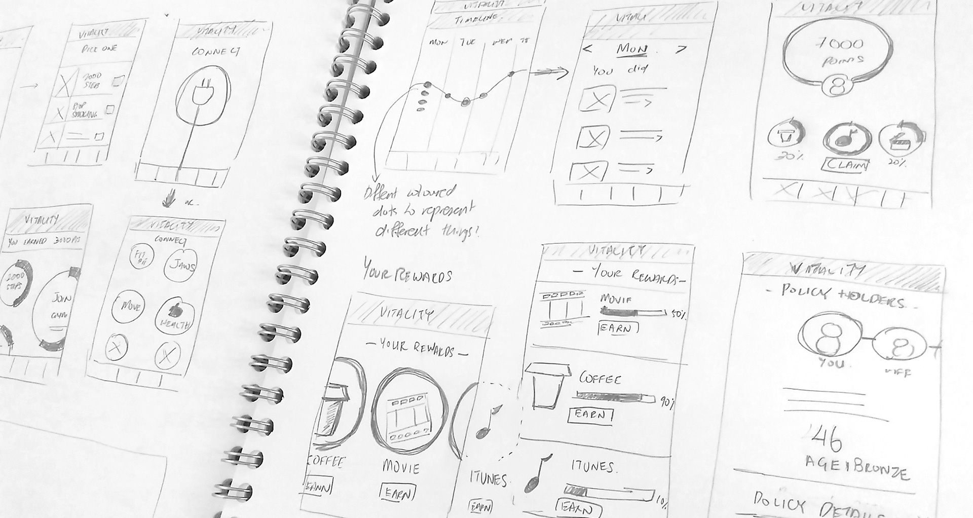
Some initial sketches
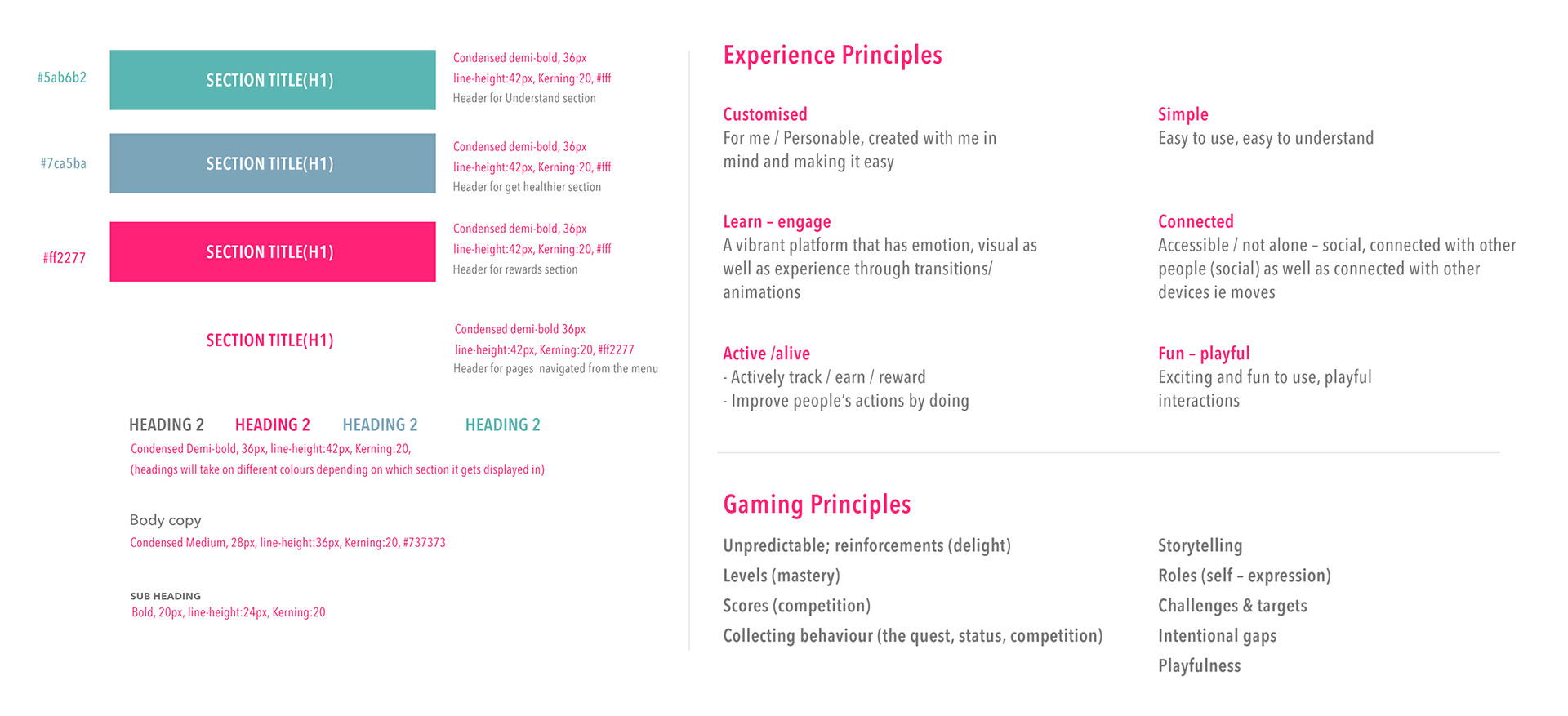
Basic style guide and experience principles
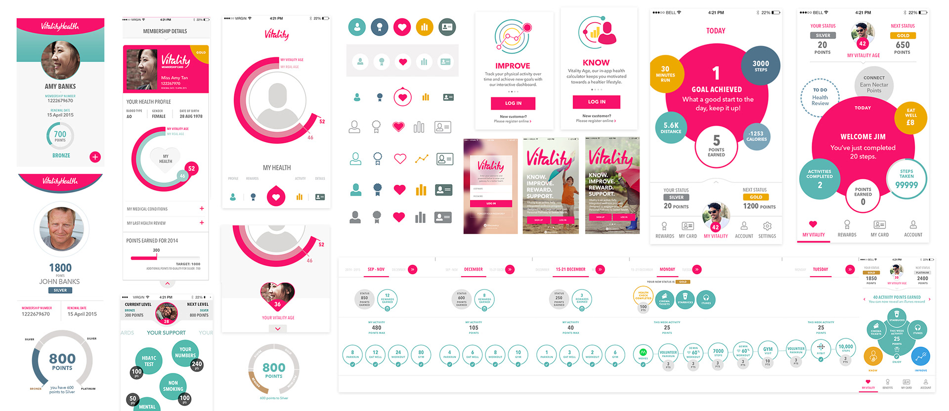
Some early explorations of the dashboard, data visualisations, timeline, login screens, navigation styles etc.
__
The outputs